When you’re driving around town, do you ever notice how some businesses have really well-made and eye-catching signs, while others seem to pale in comparison? You’re not the only one. Believe it or not, the success of many businesses has hinged on the quality of their brand signage.
As a business owner, you know that a well-designed sign can help customers find your business, learn about your products and services, and feel inspired to patronize your establishment. In this article, we’ll provide you with brand signage guidelines and best practices so you can create the most effective and visually striking displays to help strengthen your brand.
SIGN PLACEMENT GUIDELINES
Now that you know a little bit more about brand signage, let’s go over some guidelines for placing them in both vehicular and pedestrian areas.
Vehicular signage

- Signs should be at least 2 feet from the curb but no more than 10 feet away.
- Install the sign so it faces toward the approaching vehicle.
- Locate and install signs so that they are not blocked by other signage, buildings, or vegetation.
- When possible, place it on the right side of the road unless it must be read from both directions.
- Signs should either be illuminated or receive sufficient ambient light for nighttime legibility.
- Signs that require decision-making, such as vehicular navigation, need to allow the motorist adequate time to react and turn.
Pedestrian signage

- Signs should be placed in a highly visible location that does not interfere with foot traffic.
- Locate and install signs so that they are not blocked by—or interfere with—other signage, buildings, or vegetation.
- Signs should either be lit or receive ambient light for nighttime legibility.
BRAND SIGNAGE MATERIAL CONSIDERATIONS
There are many factors to consider when choosing the right material for your brand signage. Some things to keep in mind include:
Environmental conditions

Indoor or outdoor? Wet or dry? Hot or cold? Dusty or clean? High wind or direct sunlight? All of these factors can affect the type of material you choose for your sign. We always recommend choosing a local graphics installer since they’ll have a much better idea of the materials that work best in your area.
Size and shape
How big does your sign need to be? Will it be rectangular, circular, or uniquely die-cut? These dimensional considerations will also help you determine the best material for your needs.
Marketing budget
How much are you willing to spend on this project? Different materials come with different price tags, so knowing your marketing budget upfront will help narrow down your options.
Appearance and durability
You want your sign to look good and last a long time, so pay close attention to the appearance and durability of the material. If it’s an outdoor sign, make sure it can withstand the elements for years to come.
Surface texture

Some materials are better suited for certain types of graphics than others. A smooth surface, such as glass and drywall, is ideal for vinyl lettering whereas a rougher surface, like brick or concrete, may be better for dimensional letters. For more examples, check out our guide on the five surprising surfaces that are great for architectural graphics.
Brand identity
The right materials can help reinforce the look and feel of your brand. For instance, a rustic restaurant may make use of weathered wooden signs, whereas a cutting-edge IT firm might prefer a sleek metal look.
Visit our Brand Signage page to learn about Brand Ink’s wide variety of material solutions.
BRAND SIGNAGE SIZING TIPS
Once you’ve decided on the right material for your project, it’s time to start thinking about size. Here are a few things to keep in mind:
Readability

The number one rule of thumb when it comes to sign size is readability. Your sign should be big enough that people can see and read it from a distance. This is especially important for signs that are meant to be seen from the road.
Location
Where will your sign be placed? This will play a big role in how big or small your sign needs to be. If it’s going on a busy street, for example, you’ll want to make sure it’s large enough to be seen by people driving by.
Design
Your sign design should be simple and easy to read. This means avoiding small text or intricate graphics that can be hard to see from a distance. Keep it clean and straightforward for the best results.
BRAND SIGNAGE CONSISTENCY TIPS

Once you’ve created your brand signage, it’s important to keep it consistent across all of your marketing materials. This includes using the same colors, fonts, and overall look and feel on everything from your website to your business cards. By doing this, you’ll create a cohesive and professional image that will help you stand out from the competition.
BRAND SIGNAGE VISIBILITY TIPS
No matter how well-designed or well-constructed your sign is, it won’t do you any good if people can’t see it. That’s why it’s important to pay attention to visibility when creating your brand signage. Here are a few things to keep in mind:
Location
Choose a location for your sign that gets a lot of foot traffic or is visible from a busy road. This will help ensure that enough people see it to provide a high return on investment (ROI).
Lighting

If your sign is going to be placed outside or in a dimly lit space, make sure it’s illuminated so people can see it at night. You may also want to consider adding reflective tape or other high-visibility elements to make sure it stands out during the day.
Maintenance
Signs are notorious for becoming the unwanted homes of birds or insects and are prone to collecting dust and dirt. That’s why it’s important to regularly clean and maintain your signage so it continues to look its best. Beyond that, many towns have specific signage regulations in place, so failure to provide routine upkeep can even lead to legal trouble.
BRAND SIGNAGE COMPLIANCE GUIDELINES
There are many regulations that govern the use of brand signage, so it’s important to make sure you’re in compliance with all applicable laws. Some things to keep in mind include:
Zoning regulations
Before you can install your signage, you may need to get approval from your local zoning board. This process can be time-consuming, so it’s important to get your application in early.
Building codes

Your graphic signage must also comply with all applicable building codes, which can vary depending on your location. These codes cover everything from the sign’s placement to the materials that can be used.
Historic district regulations
If your signage is going up in a historic district, there may be additional regulations you need to follow. These restrictions are in place to protect the character of the area, so it’s important to get approval before proceeding with your signage project.
OTHER BRAND SIGNAGE BEST PRACTICES
Here are some final tips to consider when creating your brand signage:
Keep it simple
The best signs are usually the simplest ones. This is especially true when it comes to roadside signage, where you only have a few seconds to capture someone’s attention.
Show some personality

People love seeing creative and unique signage, so don’t be afraid to have some fun with your design. For example, if you’re a British pub, you might label your bathrooms “Lords” and “Ladies.” If done right, this can help you stand out from the competition and attract extra attention to your business.
Proofread it first
Always have more than one person proofread your signage, just to be safe. Grammatical, spelling, and punctuation mistakes can cause customers to doubt your professionalism and damage your business’ reputation. If you’d like a cautionary tale, check out our list of the five worst commercial vehicle wrap fails.
Keep it fresh
Your signage should be revamped regularly to reflect any changes in your business, such as new products or services, special promotions, and updated contact information. This will help ensure that your customers always have the most up-to-date information about your company.
Mix it up

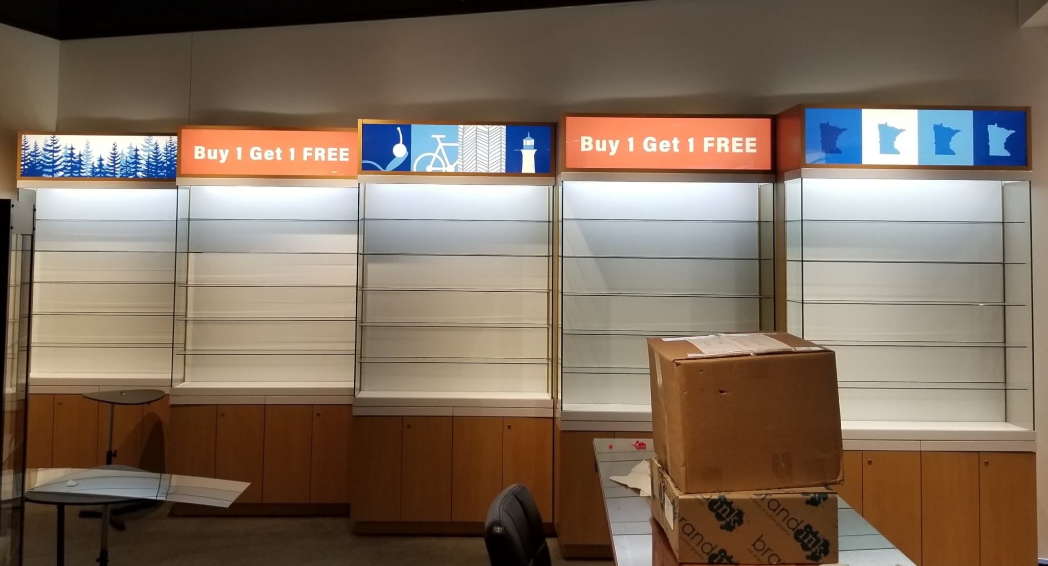
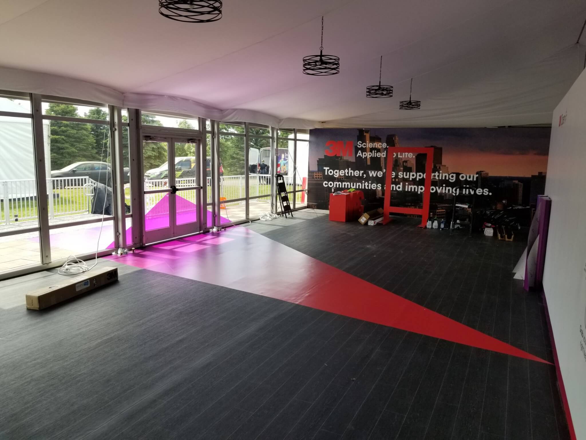
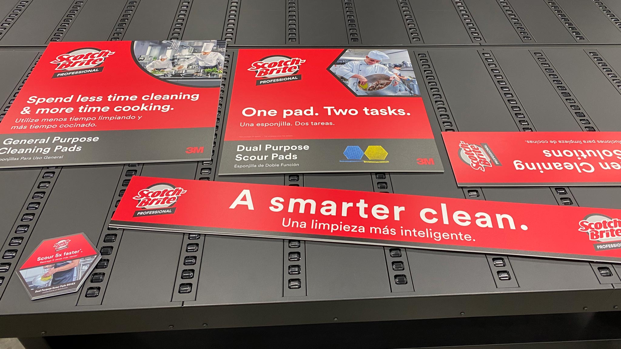
Your customers are much more likely to take notice if your signage jumps off the wall, splashes across a free-standing sign, entangles an interactive object, and melts into the floor beneath their feet. Sure, it will take some extra planning, but it will be totally worth the effort!
Install it properly
When installing your signage, make sure it’s done correctly so it doesn’t fall and cause damage or injury. If you’re not confident in your ability to do it yourself, hire a professional brand signage company in your area to do it for you.
TAKE YOUR BRAND TO NEW HEIGHTS WITH BRAND INK
By following these brand signage guidelines, you’re sure to create a display that is effective, eye-catching, and compliant with all applicable regulations. And, most importantly, you can rest assured knowing your signage will help attract new customers to grow your business.
Whether you’re looking to breathe life into a new brand or take your growing business to the next level, our team of professional designers, manufacturers, and installers has the expertise and experience to get the job done right—the first time. With our in-house design, quick turnarounds, and 3M-certified quality, wrapping your storefront with Brand Ink is the best way to elevate your brand in the eyes of your customers.
Contact us today to request a FREE wall wrap quote for your business.
Looking for more tips on creating effective brand signage? Check out our recent article that contains five pro tips for effective commercial wall wrap design.


