Creating the perfect vehicle wrap advertisement is hard. There are so many things that need to be considered (doors, windows, handles, etc.) that print and digital designers simply don’t have to worry about.
If you don’t know what you’re doing, it can be really easy to make a mistake. Sure, many of those errors are so small, the vast majority of people will never notice them as they go about their days. Fortunately, there are a handful of vehicle wrap fails so epic, we had to include them here for you to appreciate.
And of course, with all mistakes comes the opportunity to learn. So, we’ve also included some helpful car wrap design tips so you never fall victim to one of these five embarrassing blunders.
Enjoy!
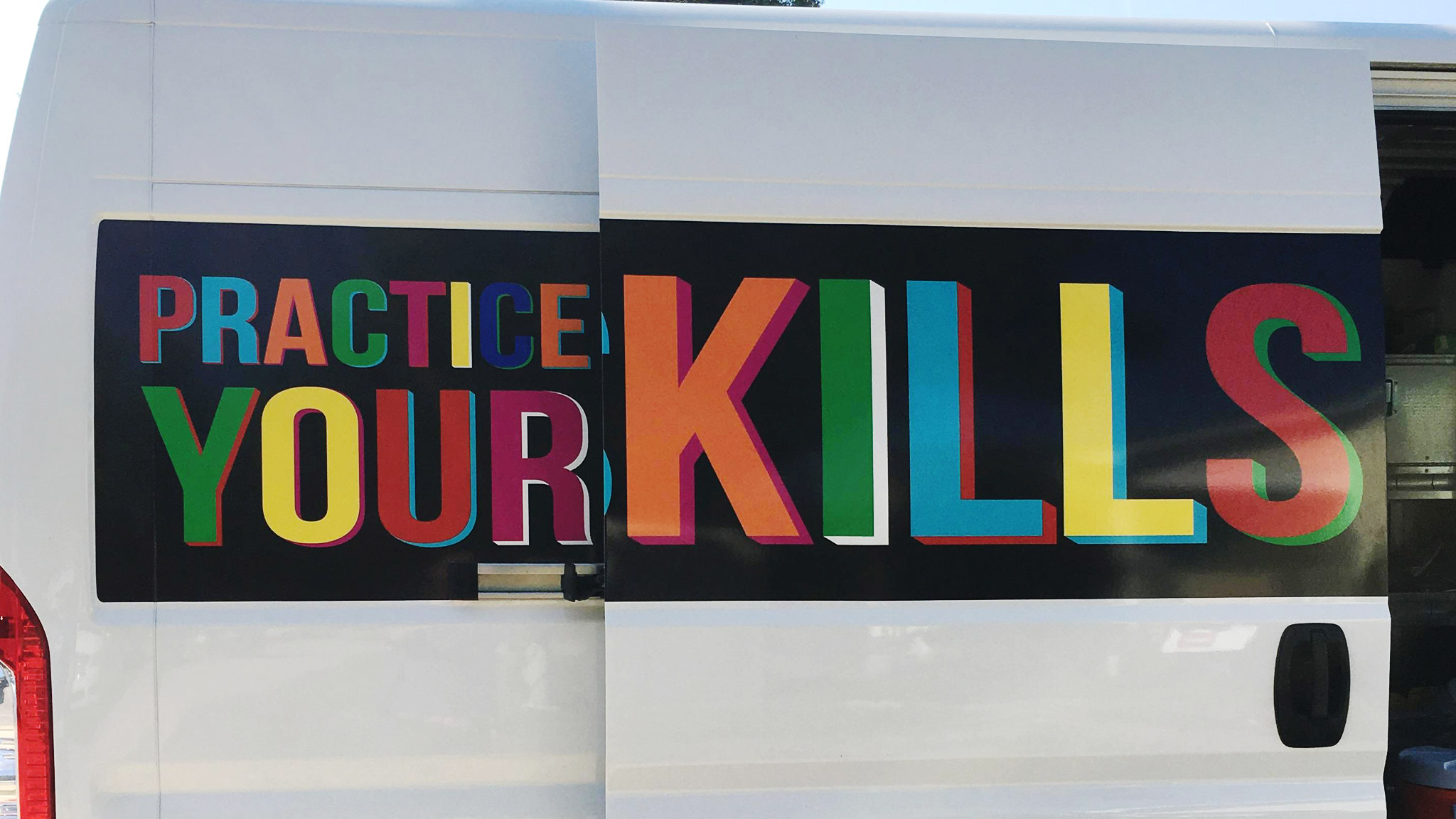
FAIL #1: FORGETTING YOUR VEHICLE DOORS OPEN

Unless you actually want your design to create a hidden image—like a Mad Magazine back cover fold-in—we recommend you take all doors and other moving vehicle parts into consideration. If your company name or tagline is too large to fit within the confines of the door, you may want to rethink its placement.

While sliding van doors are the biggest culprits here, back doors, tailgates, and regular car doors can all temporarily obstruct your message as well. Be sure to open all doors and windows and inspect your vehicle from multiple angles before you hit the road.
FAIL #2: PLASTERING YOUR FACE IN THE WORST LOCATIONS

There’d be nothing more frustrating than paying thousands of dollars to have your vehicle professionally wrapped, only to have a door handle covering two-thirds of your face. Because it still needs to function as a road-worthy vehicle, things like rearview mirrors, door handles, and—in many cases—windows need to be designed around.

While your logos, images, and text should all steer clear, a creative design can still move “through” these features to great effect. Just make sure to double-check the placement of each image before it the vinyl wrap gets applied to the vehicle.
FAIL #3: TRYING TO SQUEEZE TOO MUCH IN

The key thing to remember here is that you’re designing a moving vehicle—not a stationary object. Unless you’re stuck in the world’s worst traffic jam, your potential customers only have about 5–10 seconds to digest your message.

Don’t waste that time by shoving 18 bullet points and every service award you’ve ever won down their throats. Try to keep your design as simple and memorable as possible. Remember, if you highlight everything, you highlight nothing.
FAIL #4: USING AN OVERLY FLOWERY FONT

We get it—Palace Script looks super fancy and can make your brand look sophisticated in the eyes of your customer. With that said, it doesn’t matter how sophisticated you appear if nobody can actually read the name of your business.

Now, we know what you might be thinking, “But that’s our brand font! Don’t we need to be consistent?” In almost every other case, yes, but if your brand font is this illegible, you should probably fire your marketing agency.
FAIL #5: SETTLING FOR POOR QUALITY PHOTOS

While that grainy cellphone picture might look good on your two-inch screen, that’s not likely to be the case on your larger-than-life trailer wrap. Even on the tiniest smart car, your photo is going to be enlarged so much that the lack of quality will have nowhere to hide and will stand out in your design like a sore thumb.

Only use the most high-resolution photos or hire a professional photographer who can provide you with the level of quality you need. When it comes to acceptable photo formats, we recommend .EPS vectors, non-compressed .PDF, high-resolution .JPG, or unflattened .PSDs.
NEED HELP WITH YOUR COMMERCIAL VEHICLE WRAP ARTWORK?
Brand Ink’s in-house design team will work with you one-on-one to create the perfect look for your vehicle wrap. Whether your fleet consists of two vehicles or 200, our custom graphic team will provide you with the responsive service and consistent quality you need to make your brand look great wherever it goes. Contact us today for a free quote.


